September 20, 2010

Slums of the Internet!


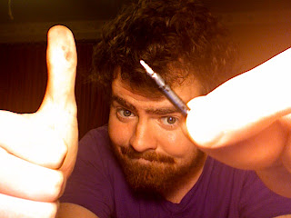
This is a quick illustration I did for the new blog my friends Mariana, Graham, and I have started called "Slums of the Internet" and is about the nastiness we find on craigslist.com. This was the illustration for a posting in where a fellow was looking for some guidance with his facial hair. I hope you enjoy it and check back often for updates!

Seriously... go to "Slums of the Internet" now!!!

September 7, 2010

Mariana's Birthday.

A wonderful friend just had a birthday. She wrote this about her birthday. I just wanted to share with everyone (with no humility) the awful present I made her: http://www.christophernoerr.com/happy_birthday_mariana.html

I'm really into badly designed web sites. If you see one, please remember to let me know about it!

September 1, 2010

MARCEL THE SHELL WITH SHOES ON

I don't want this blog to become a "stuff I like on the internet" blog but my friend Chad Powell showed this to me tonight and I instantly knew I had to tell everyone I knew. It is an insanely cute, creative video by a fellow named Dean. MY! What a swell video!

Enjoy!

MARCEL THE SHELL WITH SHOES ON from Dean Fleischer-Camp on Vimeo.

August 24, 2010

Mumford & Sons

I am a music snob. I know that. I hate that. Something in me gets upset when I realize that everybody is starting to enjoy MY music. It's mine! You can't have it. It's just selfishness. I recognize that it is basically the same as someone dating your ex. Sometimes people will tell me about music and if I feel that that person doesn't have a grasp on "good music" I will pay as much attention as I would if a homeless man told me about a great new bar. The fact that I know this about myself is proof that I am trying my hardest not to be this way. This is how I felt about Mumford & Sons when I first heard them. I heard about them from someone who's musical taste I didn't trust. I did realize though, that the music was actually solid. Four months later I listened again. I realized that the lyrics pointed to a fight between love and God; the fight between what someone thinks they want and what someone thinks they need. Something my mind has been heavy with. The lyrics seem pop influenced and simple enough to ignore but if you give it a chance you will see the sophisticated, nuanced emotional structure that lies beneath.

And my head told my heart
"Let love grow"
But my heart told my head
"This time no"
...
Oh the shame that sent me off from the God that I once loved
Was the same that sent me into your arms
Oh and pestilence is won when you are lost and I am gone
And no hope, no hope will overcome

The video for this song is silly but you can check it out here:


August 16, 2010

Little flash game makes you think about life.

This is an AMAZING flash game. Superbly designed, it feels like a animated short. It packs a powerful (if not cliche) message, too. Enjoy.

http://armorgames.com/play/6244/every-day-the-same-dream
Ok. It's as easy as this:

Horrible pen nib! All round! I'm throwing it away.

This is the Leonardt IIIEF England


This is a nearly perfect pen nib for small, consistent lines.

This is the Hunt 107

That's all for now.

August 15, 2010

A Very Nice Night

It's raining here. It's coming down in gobs. The noise is not as relaxing as it is exciting. I miss a good, hard Mobile rain. It's certainly different from any sort of precipitation I've felt anywhere else. So, I felt this would be a perfect time to sit and tell you a little about the night of this gallery show. I apologize in advance for the cold, newspaper reporter way I'm about to write. I'm just not in the mood to embellish.

I found out about this gallery called Entré Arts from a friend of a friend. They were telling me that this guy was opening a new gallery that also was studio space for several local artists, plus it would feature a cafe in the back. So the idea is that people come in for lunch, see the art AND the artists working and the work on the wall suddenly becomes more real, more personal. Anyway, I contacted a few people and got an interview right away. I showed my work to the gallery manager and he immediately asked when I could hang them. I was suspicious of his excitement. It's like the old Groucho Marx quote, "I don't care to belong to any club that would have me as a member." I came by later and hung three of my pieces; it was my author series featuring HG Wells, Jules Verne, and Rudyard Kipling.

The gallery opening was scheduled during on of Mobile's monthly "art walks" where ALL of the galleries open and try to have something exciting to draw people in. This, as I said, was the grand opening of the gallery I was in. There were so many people all the time! I stepped out a few times because I get uncomfortable around that many people pushing against each other. My pieces were on the wall next to (sort of behind) the live band which was a good and a bad thing. Good because everyone who walked in at least glanced over at the band and saw my pieces. Bad because the view wasn't great. My pieces are sort of detail oriented and need to be seen up close. Sure you can see Jules Verne, but can you see the tiny little men attacking the squid swimming by his shoulder?

Anyway, early on in the show I met some former friends of mine from high school days. Some were fun to talk to and we caught up a little. Many of them, however, were unenthusiastic and seemed upset that I was talking to them. It was a bit disheartening. I grabbed some free wine and snacks and stood guard by my pieces, reading my book. I talked to just about everyone who stopped in front of the portraits and they were all so kind, many of them telling me that my stuff was their favorite of the gallery. Most people wanted me to explain what medium I used and how I got that old cracked paint look. I told a few of them that I drew all of the cracks with an ink pen by hand. They bought the lie and were in awe of my patience. A couple people even approached me and asked me for prices and ways to contact me. I ran out of the 25 or so business cards I brought with me.

As much as I was enjoying myself by that point I started to think to myself that these cheese cubes and grapes were not going to cut it and that I was getting hungry. Not but ten minutes passed and the girl who had a large canvas next to mine returned with some pizza and a dr. pepper. I hadn't said anything to her about being hungry, she was just being kind. I was blown away by her simple kindness. The show started to wind down and I met a very cool artist who graduated from her school in New Zealand about seven months ago. She also let me know that she was going to run the cafe in the gallery and was trying to start a poetry reading there as well. I expressed my excitement about not only the prospect of a poetry reading but also at merely meeting such an interesting person. We traded websites. This is hers: http://www.elizabetelliott.com

So the gallery show ended and I left with some friends of mine from years ago who stopped by. They were much more kind than the first batch. They invited me to come hang out. I was excited because since coming back to Mobile I hadn't gotten to chill with more than one person at a time. The rest of the night I had a great time reconnecting with these wonderful people. All in all, thumbs up, Universe... Thanks for a good time.

Click on the photos below to enlarge them. (don't get too disappointed about the shots taken with my phone. Haha!)

August 11, 2010

Trivial Musings on Movie Posters

Perhaps you've noticed some of the trends in movie posters. I have only because I have been on the "watch instantly" portion of Netflix's web site almost every night this last week looking for movies that I've always wanted to watch but never had the chance. You can't help but notice these movie posters. Netflix uses them all over their website. I think that one of the most unique things about movie posters is that it is art that was once used to advertise and now it becomes the visual identifier (much like an album cover.) After leaving theaters, movies rely on slick photography and graphic design to sell the consumable copies. The problem that I see with most movie posters is that they are all some variation of the same thing. The main characters front and center so you can get a good close look at those pretty celebrity faces. They are usually overly glossy. Few ever utilize illustration. (God bless indie films) The most obvious trend of the typical poster is the disembodied head. This is so obviously worn out that it has been spoofed by the comedy website "funny or die" and can be seen here! The trend that I am starting to get sick of is the little boxes either containing scenes or faces. I don't have much commentary on this, witty or otherwise. I do how ever have more than a few examples:

July 2, 2010

"there's honey out there, and i'm going to find it"


Me and my best friend/favorite artist, Graham Abbott are assigning each other fake illustration projects to keep each other on our toes... he gave me: "there's honey out there, and I'm going to find it" and I used this prompt to try this new style that's been kicking in my brains.

May 27, 2010

Updated Website


I just updated my website... It's a lot cleaner under the hood and easily update-able. I'm excited to see it in action.